- General
- Links, Title and Reach Beta
- Average Hydrograph
- Median Hydrograph
- Permit Application Success Rate
- Season Date and Flow Ranges
- Graphs - All Together
- Right Side Details
- Notes and Credits
- Links, Title and Reach Beta
You may arrive at a River Permit page from Dreamflows in a number of ways:
- Via a link from the River Permit Index page (the link is always named "Permit Info").
- Via a link from a flow report page (the link name is descriptive, for example "MF Salmon Permit").
- Via a link from a cross-listing page (the link is always named "Permit Info").
However, in what follows, parts of the sample page may be blanked out or omitted to make it clearer which area of the image is being discussed.
The following applies:
The first line gives the river and reach, which are repeated further down the page and discussed below.
Clicking the
![]() icon just to the right of river and reach brings you to this help page.
icon just to the right of river and reach brings you to this help page.
Official Permit Rules links to a page giving official permit application rules and other pertinent information. Sometimes only a single official web page is available (or needed) to discuss everything of interest, but other times the information is spread over several web pages. In that case there will be links from the first official page to other pages of interest. It's in your interest to read and fully understand every rule and instruction given on each page. Sometimes the information given is vague, and / or contradictory. Contact the permitting agency to resolve issues - getting some seemingly insignificant detail about your trip wrong could result is delays or even cancellation of your trip.
Launch Calendar (if present) links to the launch calendar for this permit. This shows the number of private and commercial launches each day. The number of private launches can vary during the permit season, and applying for a permit on a day with many private launches improves the odds of getting a permit.
Permit Application FAQs, or More Permit Info, or similar (if present) links to an auxilliary (but still official) page that Dreamflows thinks may be particularly relevant.
Permit Application Notes (if present) links to the relevant entry in a PDF hosted by Down River Equipment (and sponsored by them). This page summarizes the application process for that permit, however be aware that as of writing, it is incomplete in places. It was also written for 2016, so some of the information is out-of-date. Nevertheless, for the most part it can provide a useful quick-lookup reference after you've read the official pages.
The Show Median Graph button toggles between graph views. By default, only the average hydrograph is displayed. When Show Median Graph is clicked, both median and average hydrographs are displayed (the button label changes to Hide Median Graph). The difference between Average and Median flow graphs is discussed in the Median Hydrograph section below.
The top of the yellow box gives the title and reach beta. In this example, they together say that this permit is for the Boundary Creek to Cache Bar reach/run on the Middle Fork of the Salmon River in Idaho, the information supplied here is for the 2017 permit year, the reach is 100 miles long, and the difficulty is generally considered class III to IV.
Note that the "beta" is approximate - the length of the run depends on where you put in and take out, and the difficulty depends on flow, craft type, and other factors. Always consult a guidebook to get the full scoop on length and difficulty.
Note also that beta will sometimes have a qualifier appended in parentheses. If the beta were III to IV (V) instead, then that would mean the run was class III to IV overall, but that it contained class V rapid(s). If the beta were III to IV (P) instead, then that would mean the run was class III to IV overall, but that it contained portage(s).
Note that the permitting year won't necessarily be the current one - for instance for Grand Canyon, applications accepted in 2017 are for the 2018 permit year.
At the bottom of the page, there are four links:
- River Permit Index links to a page listing all the permit pages currently offered by Dreamflows.
- Daily Flows links to the most appropriate daily river flows entry for this permit.
- Xlist Entry links to the most appropriate cross-listing page entry for this permit.
- Dreamflows Home links to the Dreamflows home page.
The following applies:
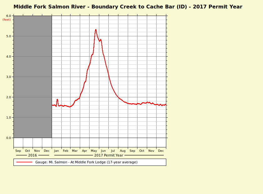
The graph (red) is a weighted average, which in this context means that for each day of the year being calculated, the displayed value is the average for that day, mixed in with average values from adjacent days to smooth the results somewhat.
The legend below the graph indicates that this plot is for the Mi. Salmon - At Middle Fork Lodge flow site, and that it's a weighted average of 17 years of data.
Note that the displayed hydrograph is a weighted average of the available data. Values could be quite different this year.
The Y-axis in this example is gauge height in feet, as indicated by the red (feet) legend. Other graphs may display river flow in cubic feet per second, and that will be indicated by a red (cfs) legend instead.
While these weighted average graphs probably aren't particularly accurate in detail, they should show clear general trends.
The following applies:
This graph is displayed when the Show Median Graph button is pressed.
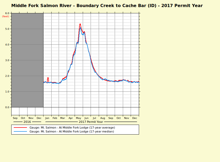
The red graph (partly hidden) is the weighted average, see the previous section.
The light blue graph is the weighted median, which in this context means that for each day of the year being calculated, the displayed value is the median for that day, mixed in with median values from adjacent days to smooth the results somewhat.
The main advantages of the traditional average (or mean) are that all the available data contributes to the result, and the concept is familiar to most everyone. A downside is that even a single very large (or very small) outlying value can skew the results significantly (as shown below).
On the other hand, the median ignores all the outlying values, and uses only the central value (or in some cases central two values). If most years have the same general flow pattern, then this is a useful way to represent the data (since unusual "crazy" data is ignored). However, if flows are all over the place, then the resulting median graph can be misleading.
In the case of the Mi. Salmon - At Middle Fork Lodge gauge above, the average and median graphs are very similar. The implication is that the Middle Fork Salmon probably has a consistent / predictable flow pattern. Of course low water years will have low flows, and high water years high flows, but it seems likely that most years will follow the general pattern shown above.
On the other hand, consider:
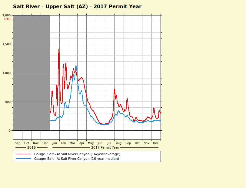
In this case, the two graphs don't correspond at all well.
The median graph is reasonably smooth, yet the average graph is all over the place in
January, February, August, September, and to some extent December.
When one sees a mismatch like that, it's worth finding out why.
[In this case it's because during those months flash floods (with flows all the way up to 50,000 cfs) occur from time to time.
The high spikes affect the average graph directly, but not the median graph.]
Permit Application Success Rate
The following applies:
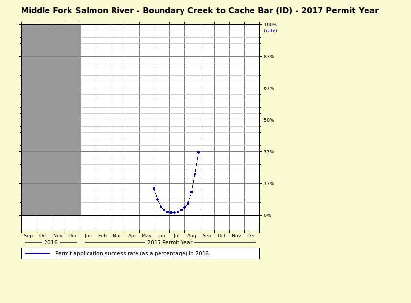
This graph (blue) plots the success rate of permit applications in the specified year (2016 in this example).
The success rate is shown as a percentage.
The blue dots are data points, computed by averaging the success rates of actual permit applications on and around that date.
The thin blue lines joining the dots are there to make the plot clearer, but aren't in themselves part of the data.
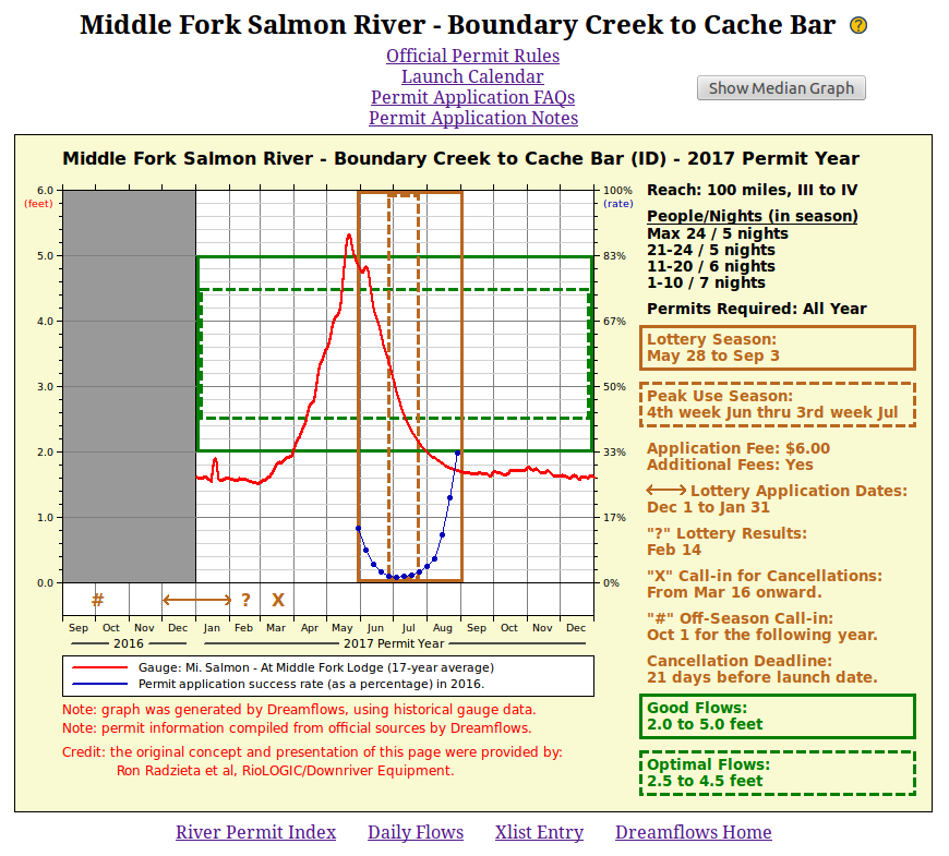
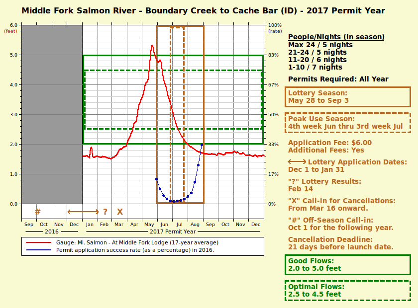
In this example, the plot says that in 2016 the chance of getting a permit with a July launch date was low (less than 5%), but the chance of getting a permit for a late August launch date was much better (about 33%).
Please note that the percentages are for the given year (2016 in this case), and the percentages for later years are sure to be different. However, the general trend is likely to be similar.
The following applies:
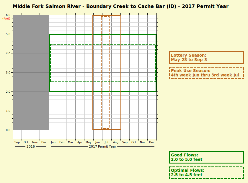
The solid orange box in the graph area shows the range of the "season".
In this case the reach/run has a lottery so it's considered the Lottery Season.
The right panel says the lottery season is from May 28 to September 3, so the box in the graph area shows the same period.
The dotted orange box (if present) shows the peak use part of the "season". In effect, it means the time of year that it's hardest to get a permit. In this example, the peak use season extends from the 4th week of June through the 3rd week of July.
The solid green box in the graph area gives the range of generally-accepted "good flows". Note that's a hugely subjective term, depending on craft type and much else besides. It's also a vague term: to some paddlers it means the range of "fun flows", to others the range at which they found it physically possible (though not necessarily safe or even fun) to run the river. Dreamflows displays "fun flows" where known, otherwise whatever values are available.
The dotted green box (if present) gives the range of "optimal flows". That's subjective too, though at minimum it should indicate flows that most paddlers consider both safe and fun.
The following applies:
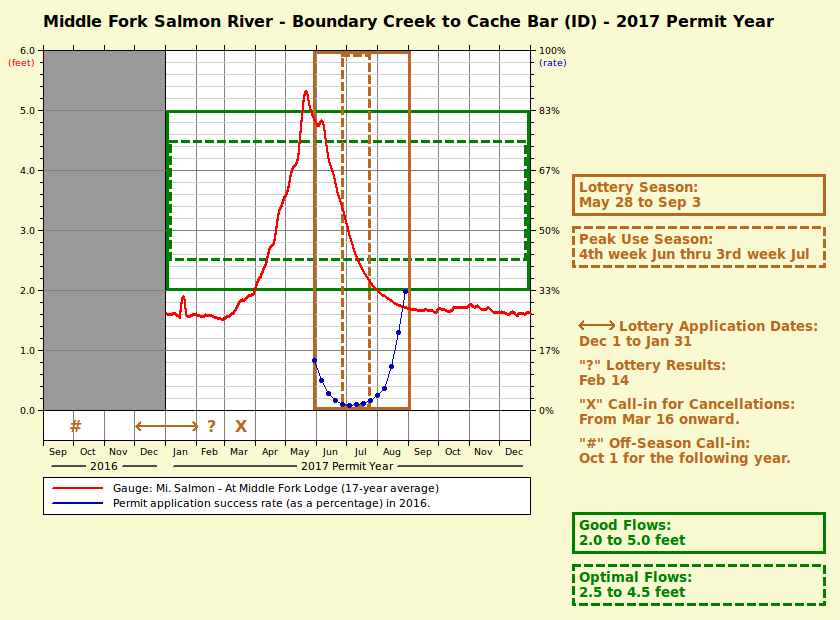
This is really the heart of the page.
It graphically displays when the lottery season is, what the "good" flow range is, and when flows can be expected to be at the intersection of the two.
See the previous sections on how to interpret individual components of the graph.
Personally, I'd interpret the above graph as follows. Early season flows are high, then drop quite quickly. Flow tends to drop below the "good flow" range early August. But, as you'd therefore expect, it becomes progressively easier to get a permit from early August onward. It's also relatively easy to get a permit early in the season. Reasons might include higher and/or unpredictable flows, colder weather, and that access to the normal put-in may be hard or impossible (due to snow). Statistically, the best time to run the river is in late June / July, but lotsa luck getting a permit then.
So - back to your world - which launch date to ask for in your permit application? Decisions, decisions, but the graph should at least give you an informed starting point.
The area just below the graph graphically displays certain dates or date ranges given on the right side. Should be self-explanatory (except perhaps for what the terms actually mean - and they're explained in the next section).
The following applies:
Turns out pretty much every permitted river uses a different permit/lottery system than most any other.
So, the right side (which lists relevant permit application dates and other details) can vary widely between different permits.
The following may appear:
- People/Nights, or some variation thereof, gives the maximum number of people/nights/craft/etc allowed on a single permit.
The values given are good for the range of dates in the solid orange box (Lottery Season or Permit Season).
The values could be the same or different out of season.
- Permits Required tells you when any kind of permit is required.
Sometimes it's the same as Lottery Season or Permit Season, sometimes not.
- Lottery Season (with a corresponding solid orange box in the graph on the left) gives the dates when permits issued by lottery are required.
Rules vary as to when you must be off the river if you put on before the season begins; check the official rules for the permit of interest.
If there's no Lottery Season, then Permit Season gives the dates when permits are required.
- Peak Use Season (with a corresponding dotted orange box in the graph on the left) is the peak use part of the "season".
In effect, it means the time of year that it's hardest to get a permit.
- Application Fee is a non-refundable reservation fee submitted with the permit application.
- Additional Fees indicates whether fees (in addition to the Application Fee) apply.
If so, they may be due when the application is submitted, after the permit is approved, or both.
These additional fees may or may not be refundable.
See the official permit rules for details.
If Additional Fees is Yes but Application Fee is None, then no initial application fee is required, but fees are still due after the permit is granted.
- Lottery Application Dates (with a corresponding <----> below the graph on the left) says when lottery applications are accepted by the permitting agency.
Don't expect any leeway.
Be wary of submitting duplicate applications (most likely all will be rejected, not just the duplicates).
- Lottery Results (with a corresponding ? below the graph on the left) says when the lottery results are expected to be available.
The date may be approximate.
The way you determine if your application was successful or not varies: see the official rules for details.
- Call-in for Cancellations (with a corresponding X below the graph on the left) gives the earliest date that it's worth checking to see if unassigned permits from the lottery have become available.
This might be because no-one requested that launch date, or someone won a permit but then later cancelled, or won a permit but then later lost it by not meeting some requirement.
- Off-Season Call-in (with a corresponding # below the graph on the left) gives the earliest date that it's worth trying to reserve future off-season permits.
These permits may be available on a walk-in basis but still limited to a certain number of people or launches per day.
In that case the Off-Season Call-in process offers you a way to reserve a slot ahead of time.
- Cancellation Deadline is the latest you can cancel without penalty.
It's polite to cancel as soon as you know you need to, so others can take your slot.
However, if a cancellation deadline is given and you miss it, expect it to affect your refund and/or your ability to apply for future permits.
Sometimes there are two deadlines (one affecting refund, the other affecting future permits), in which case the earlier one is given here.
- Good Flows (with a corresponding solid green box in the graph on the left) shows the range of generally-accepted "good flows".
See Season Date and Flow Ranges for more information.
- Optimal Flows (with a corresponding dotted green box in the graph on the left) shows the range of generally-accepted "optimal flows". See Season Date and Flow Ranges for more information.
Nothing to add at this point, except to thank Richard Ferguson and Ron Radzietta et al for their contributions to this project.